LiftNXT Training
Help Center
How can we help you?
Flex Overview (1.0)
Note
This article is only relevant for DudaFlex version 1.0 users. If you began using DudaFlex after July 18, 2022, see DudaFlex Overview.
What is Flex?
Flex is a new mode for designing sections and pages, based on new inline editing technology and flexible layouts like: CSS grid, flex, improved alignment, and so on. Flex allows full responsiveness and pixel-perfect accuracy for any element by breakpoints.
Flex is seamlessly integrated in the existing editor so users can choose when and where to use it. This means that Flex contains all of the same benefits of our editor, but with vastly more design capabilities.
Add Flex Sections
To add a Flex section:
- Hover between rows, and click the Add Section button. Sections display in the side panel. Alternatively, right-click to open the context menu, and click Add Section.
- In the side panel, click Flex Sections.
- Click the Flex section you want to add, and at the top of the page, click Save.
- Flex Mode opens with the section to edit.
For more information, see Add and Edit Flex Sections (1.0).
Flex Mode Overview
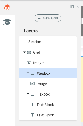
Layers Panel
The layers panel displays on the left side of the editor and shows the elements on the page (grids, widgets, flexboxes, text boxes, and so on). From here, you can select, rearrange, and rename elements. The layers panel always starts with the section, under it are the grids followed by widgets or containers.
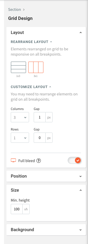
Design Panel
The design panel displays on the right side of the editor and contains your design controls for the selected element (container, flexbox, widget). The design options include layout, sizing, alignment, and more.
Design Panel Sizing Measurements
You have multiple sizing measurements in Flex.
- Pixel (px). Size stays the same on every breakpoint.
- Viewport Width (vw). % of the width of the element when displayed on a given screen. 10vw is 10% of the viewport width. 100 vw takes up 100% of the screen width. By default, margins and widget sizes are set in %.
- Viewport Height (vh). % of the height of an element when displayed on a given screen. 10vh is 10% of the viewport height on every screen size.
- A. Size is automatically determined by content.
- Min & Max. The smallest/largest measurement of an element. This setting ensures that an element does not get smaller/bigger than this when resizing.
Alignment
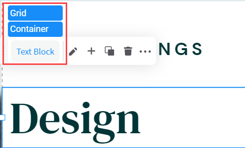
Arrange
You can reorder overlapping objects from both the Design panel and the Layers panel, by simply dragging the object below or above.
Flexbox Self-Align vs Alignment
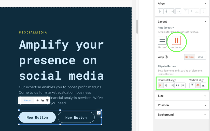
For flexboxes, there are two different automatic alignment settings in the Design panel.
- Under Layout, select Vertical or Horizontal layout to set an axis for elements inside the flexbox.
- Under Align in Flexbox, select how elements will be placed in the selected axis.
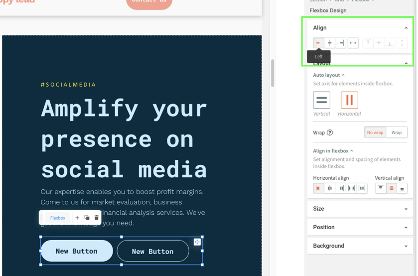
Under Align, select how the entire flexbox will be aligned relative to the grid. You can only align under the contrary axis.
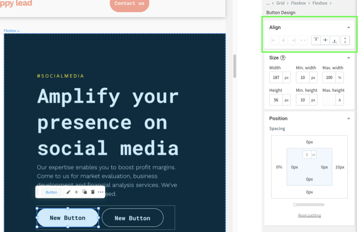
Under Align, select where an element within a flexbox (for example, a button) is aligned on the chosen auto layout axis.
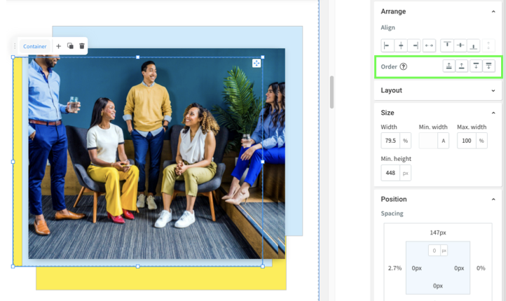
Pin
In the Design panel, you can pin elements to a specific position in a cell, so the location stays the same relative to the cell when the size of the cell changes.
To pin an element to a position in a cell:
- Select the element, and in the Design panel, scroll to Position.
- Next to Pin, click the arrow corresponding to where you want to pin the element in the cell.
The element stays pinned to this location in the cell when the grid size changes.
Breakpoints
Note
For information about making your site responsive, see Responsive Tablet.
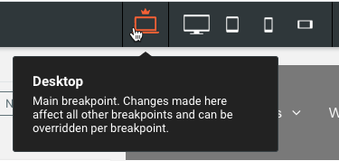
A breakpoint is the size where the design adjusts for a specific screen width. Breakpoints enable designs to be responsive as they scale up and down. In Flex, the default breakpoints are:
- Desktop (1025px-1399px)
- Wide desktop (1400px and up)
- Tablet (768px-1024px)
- Mobile (767px and below)
- Mobile landscape (468px-767px)
You can switch between breakpoints at the top of the page by clicking the different views.
You can also hide certain elements on specific breakpoints. For more information about breakpoints and how to hide elements, see Flex Breakpoints (1.0).