LiftNXT Training
Help Center
How can we help you?
Flex Breakpoints (1.0)
Note
For information about making your site responsive, see Responsive Tablet.
A breakpoint is the size where the design adjusts for a specific screen width. Breakpoints enable designs to be responsive as they scale up and down. In Flex, the default breakpoints are:
- Desktop (1025px-1399px)
- Wide desktop (1400px and up)
- Tablet (768px-1024px)
- Mobile (767px and below)
- Mobile landscape (468px-767px)
Note
For best results, you should check changes for mobile breakpoints on a mobile device and not by resizing a desktop screen.
You can switch between breakpoints at the top of the page by clicking the different views.
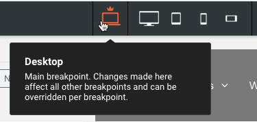
Changes made in the main breakpoint (desktop) affect all breakpoints. However, if you need to make changes to position and size of elements (non-structural changes) for some specific breakpoints (for example, mobile landscape), these changes will not affect the other modes. Changes made to the Mobile (portrait) breakpoint affect the Mobile Landscape breakpoint.
Structural Changes
Structural changes made on any breakpoint affect all other breakpoints. When you are on a breakpoint other than the main breakpoint (desktop), and make a structural change, a warning message displays to inform you that the change affects all breakpoints. The following are examples of structural changes:
- Deleting or adding content
- Drag a widget inside a flexbox
- Removing a widget from a flexbox and placing it on the grid
- Deleting a widget inside a container
- And more
Hide on Breakpoint
You may want to hide certain elements on specific breakpoints (for example, hiding an image on mobile devices).
To hide an element on a specific breakpoint:
- Switch to the breakpoint you want to hide the element on by clicking the view in the top navigation.
- Click the element you want to hide.
- In the Layers panel, click the Hide on this breakpoint button next to the element.
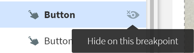
- If you hide an element that has other nested elements within it (for example, hiding a container with two button widgets in the container), all nested elements will also be hidden on that breakpoint.
To unhide an element, in the Layers panel, click Show on this breakpoint next to the hidden element.
Note
Hiding elements on the main breakpoint does not affect the other breakpoints. For example, a button hidden on the main breakpoint is still visible on the tablet breakpoint (and all other breakpoints).